matplotlib
- matplotlib ... data visualization package 全体
- pyplot ... matplotlib 内のパッケージ。FiguresやAxesのデフォルト設定を用いて描画するのに使う。
- pylab ... pyplot と numpy を同時にimportする。一部の組み込み関数が上書きされたりするので、IPythonやjupyterとは相性が悪い。pyplotを使う方がよいようだ
jupyter notebook から使うには %matplotlib マジックを使って inline, qt を使うとよい。
import matplotlib.pyplot as plt
公式のTutorial
version 2.1 以降は公式のドキュメントが随分整備されたようだ。 まず公式を読んだ方がいいと思われる。
https://matplotlib.org/2.1.1/tutorials/index.html
Matplotlib Tutorial
https://www.datacamp.com/community/tutorials/matplotlib-tutorial-python
# Matplolib Tutorial: script.py
import matplotlib.pyplot as plt
import numpy as np
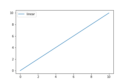
x = np.linspace(0, 10, 100) # prepare the data, 等差数列(start, stop, num)
plt.plot(x,x,label='linear') # plot the data
plt.legend() # add a legend (凡例、説明文)
plt.show() # show the plot

# np.linspace は等差数列のデータを生成する
x = np.linspace(0,10,5)
print(x)
2つのコンポーネントについて理解すべし。
- Figure
- Axes
全ての要素が描画されるウィンドウであり、トップレベルの要素である。独立したFigureを複数個作成することもできる。subtitle(中央に表示されるタイトル), legend(凡例、説明), colorbarなどを付加できる。
Figureに対してAxesを付加できる。Axesとはデータをplot()やscatter()関数によって描画するときの領域である。
import matplotlib.pyplot as plt

fig = plt.figure()
ax = fig.add_subplot(111)
ax.plot([1, 2, 3, 4], [10, 20, 25, 30], color='lightblue', linewidth=3)
ax.scatter([0.3, 3.8, 1.2, 2.5], [11, 25, 9, 26], color='darkgreen', marker='^')
ax.set_xlim(0.5, 4.5)
plt.show()

import matplotlib.pyplot as plt

plt.plot([1, 2, 3, 4], [10, 20, 25, 30], color='lightblue', linewidth=3)
plt.scatter([0.3, 3.8, 1.2, 2.5], [11, 25, 9, 26], color='darkgreen', marker='^')
plt.xlim(0.5, 4.5)
plt.show()
上の2つのコードを比較すると、2番目のコードの方がわかりやすいと思う。
しかし、複数の軸を使うときは、Axesオブジェクト ax を明示的に使用する最初のコードの方が適切なのである。
- x-axis, y-axis ... どのAxesにもこれらが存在する。これらのaxisに label, title, legend を付加できる。
- spine ... 軸の目盛をつなぎ、データ領域の境界を表示する。データを表示していないときは、黒い長方形の領域があり、axisを初期化すると(x軸方向0.0-1.0, y軸方向0.0-1.0で)左枠と下枠が表示さ れる。
Data For Matplotlib Plots
plot()関数には、numpyのarrayとlistが渡せる。
Create Your Plot
add_axes で [ left, bottom, width, height ] を指定する。
import matplotlib.pyplot as plt

fig = plt.figure()
fig.add_axes([0, 0, 1, 1])

subplot popup を追加する。
subplot は通常の格子のAxes の上に配置する。
したがって、両者は同義語とみなされることが多い。
厳密にいうと add_axes() と add_subplots() は動作が異なる。
import matplotlib.pyplot as plt
import numpy as np

fig = plt.figure()
ax = fig.add_subplot(111)
ax.scatter(np.linspace(0,1,5), np.linspace(0,5,5))
plt.show()

add_subplots(111) の 111 は 1, 1, 1 を表していて、それぞれ「行数 (1)」、「列数 (1)」、「plot番号 (1)」を意味している。
2x2のsuplotsを作成して、その1番目に表示すると次のようになる。
import matplotlib.pyplot as plt
import numpy as np

fig = plt.figure()
ax = fig.add_subplot(2,2,1)
ax.scatter(np.linspace(0,1,5), np.linspace(0,5,5))
plt.show()

import matplotlib.pyplot as plt
import numpy as np

fig = plt.figure()
# 1 2
# 3 4

ax = fig.add_subplot(2,2,1)
ax.scatter(np.linspace(0,1,5), np.linspace(5,10,5))

ax2 = fig.add_subplot(2,2,2)
ax2.scatter(np.linspace(1,2,5), np.linspace(10,5,5))

ax3 = fig.add_subplot(2,2,3)
ax3.scatter(np.linspace(0,1,5), np.linspace(0,5,5))

ax4 = fig.add_subplot(2,2,4)
ax4.scatter(np.linspace(1,2,5), np.linspace(10,5,5))

plt.show()

add_subplot(rows, cols, id) は rows $\times$ cols のgridを作り、id で指定したAxes が返される。
add_axes([left, bottom, width, height]) は左下の位置と幅・高さを [0, 1]の範囲の割合で指定して作成した Axes が返される。
import matplotlib.pyplot as plt
import numpy as np

x = np.linspace(-2, 3, 10)
y1 = x
y2 = x ** 2

fig = plt.figure(figsize=(5,4))

ax = fig.add_axes([0.1, 0.1, 0.9, 0.9])
ax.scatter(x, y1)

ax2 = fig.add_axes([0.6, 0.2, 0.35, 0.35])
ax2.scatter(x, y2)

plt.show()

import matplotlib.pyplot as plt

fig = plt.figure(figsize=(20,10))
ax1 = fig.add_subplot(121)
ax2 = fig.add_subplot(122)

# fig, (ax1, ax2) = plt.subplots(1, 2, figsize=(20,10))

ax1.bar([1,2,3],[3,4,5])
ax2.barh([0.5, 1, 2.5], [0.2, 1, 2])

plt.show()

- ax.bar() ... 垂直方向の長方形
- ax.barh() ... 水平方向の長方形
- ax.axhline() ... 軸をまたぐ水平方向の線
- ax.vline() ... 軸をまたぐ垂直方向の線
- ax.fill() ... 塗りつぶされた多角形
- ax.fill_between() ... yの値と0の間を塗りつぶす
- ax.stackplot() ... stack plot
import matplotlib.pyplot as plt

fig = plt.figure()
ax1 = fig.add_subplot(131)
ax2 = fig.add_subplot(132)
ax3 = fig.add_subplot(133)

ax1.bar([1,2,3], [3,4,5])
ax2.barh([0.5, 1, 2.5], [0.2, 1, 2])
ax2.axhline(0.45)
ax1.axvline(0.65)

x = np.linspace(-2,3,10)
y = x ** 2
ax3.scatter(x,y)

plt.show()

軸を消す
import matplotlib.pyplot as plt
import numpy as np

fig = plt.figure()
ax1 = fig.add_subplot(131)
ax2 = fig.add_subplot(132)
ax3 = fig.add_subplot(133)

ax1.bar([1,2,3], [3,4,5])
ax2.barh([0.5, 1, 2.5], [0.2, 1, 2])
ax2.axhline(0.45)
ax1.axvline(0.65)

x = np.linspace(-2,3,10)
y = x ** 2
ax3.scatter(x,y)

fig.delaxes(ax3)

plt.show()

plotの外にlegend(凡例)を表示する
いろんな方法があるが legend() がよく利用される。
loc or location 引数に center left と upper right を指定する。
bbox_to_anchor 引数に右上を指定することもできる。
title と軸のラベルを表示する
ax.set(title="A title", xlabel="x", ylabel="y"), ax.set_xlim(), ax.set_ylim()
fig.subtitle()
plt.title(), plt.xlabel(), plt.ylabel()
表示、保存、閉じる
import matplotlib.pyplot as plt
import numpy as np

x = np.linspace(0, 10, 100)
plt.plot(x, x, label='linear')

plt.legend()

plt.show()
import matplotlib.pyplot as plt
import numpy as np

x = np.linspace(0, 10, 100)
plt.plot(x, x, label='linear')

plt.legend()

plt.savefig("foo.png")

plt.savefig("bar.png", transpatent=True)
FIgureを個別に同じPDFに保存する。
# How to save a plot to a PDF file
from matplotlib.backends.backend_pdf import PdfPages

x = np.linspace(0, 2*np.pi, 20)
y1 = np.sin(x)
y2 = np.cos(x)

pp = PdfPages('test.pdf')

plt.figure()
plt.plot(x, y1)
pp.savefig()

plt.figure()
plt.plot(x, y2)
pp.savefig()

pp.close()


開いているFigureをPDFに一括保存する
# How to save a plot to a PDF file
from matplotlib.backends.backend_pdf import PdfPages

x = np.linspace(0, 2*np.pi, 20)
y1 = np.sin(x)
y2 = np.cos(x)

plt.figure()# How to save a plot to a PDF file
from matplotlib.backends.backend_pdf import PdfPages

x = np.linspace(0, 2*np.pi, 20)
y1 = np.sin(x)
y2 = np.cos(x)

plt.figure()
plt.plot(x, y1)

plt.figure()
plt.plot(x, y2)

pp = PdfPages('test2.pdf')
fignums = plt.get_fignums()
for fignum in fignums:
    plt.figure(fignum)
    pp.savefig()

pp.close()